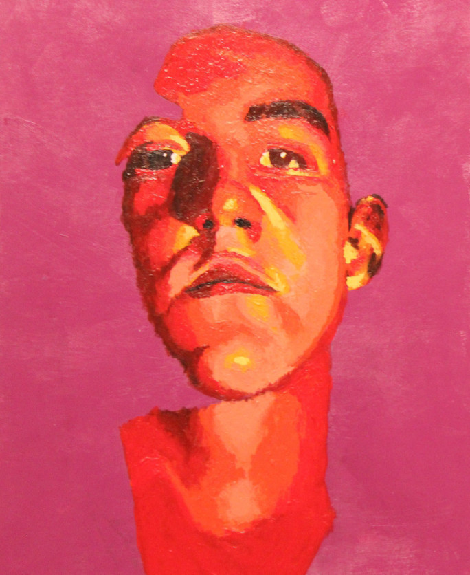
Portrait Project
2015, Acrylic Paint
11" x 8.5"
In my Portrait Project I photographed myself in a banal pose and paired it with opposing colours on the colour spectrum. I combined primary colours with their tertiary’s to create a harmonious colour palette that was eye catching. I took out the previously black background and swapped it with a red-violet background which creates a reverse figure type of effect.
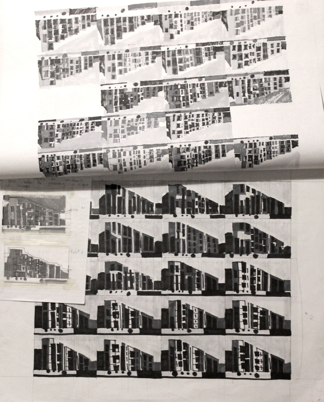
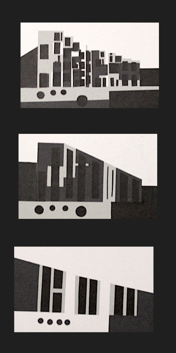
Structural Abstraction
2015, Cut Paper, 3x 3.5" x 6"
For this project I was given an image with a piece of architecture and I began the process of abstracting and simplifying the image. Through 3 general abstraction I created an exaggerated form of the original building. This project was interesting because I was able explore the process of abstraction and I was able to see it as a final piece rather than one final abstraction.
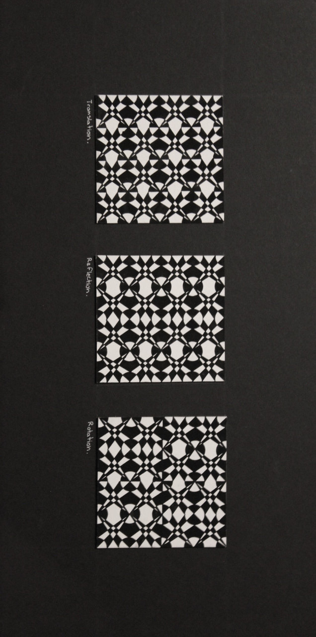
Reverse Figure Ground
2015, Gauche, 3x 4" x 4"
This project has played a really important role in my practice because I was able to implement so many different fundamental design practices. I created a simple geometric design and translated it in different variations. I was able to play around with Gestalt Theory and proximity through placing different shapes and playing with orientation.
Rationale
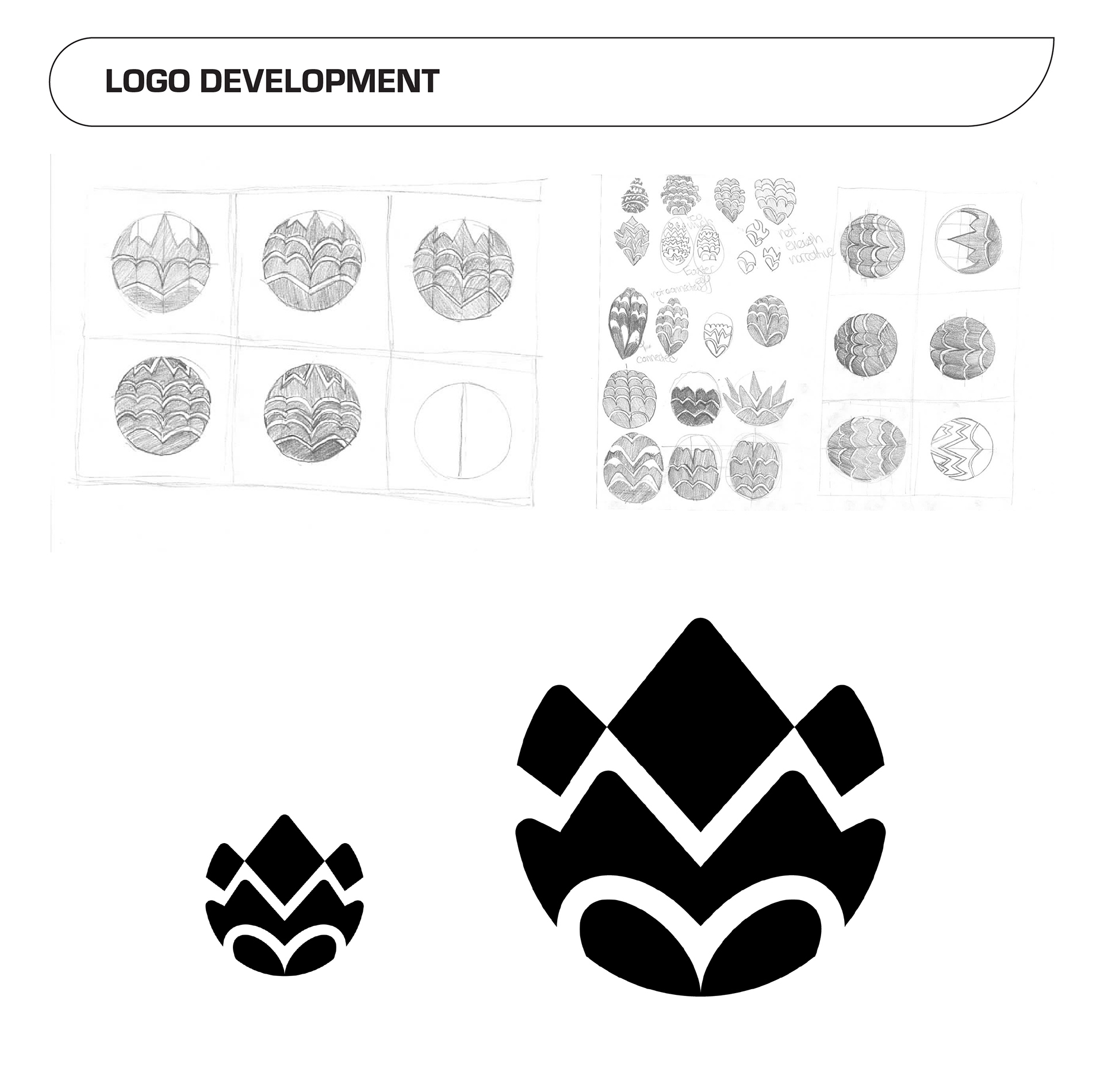
I began my project with first understanding the ramifications around my product through a group discussion. I was able to understand just what lip plumper was, who would be using it, what flower best represented the product and even early colour palette discussion. After that I began my independent research with a short word map helping me to start the genesis of my project and shortly after that I began to ask really important questions like “What does the consumer look like?” and “Where does said consumer live?”, “Are they active social members of society?”. After that I began experimenting with different derivative shapes that had different visual motifs and cadences and I kept at that for a nearly 3 weeks until I got to a seemingly good solution.
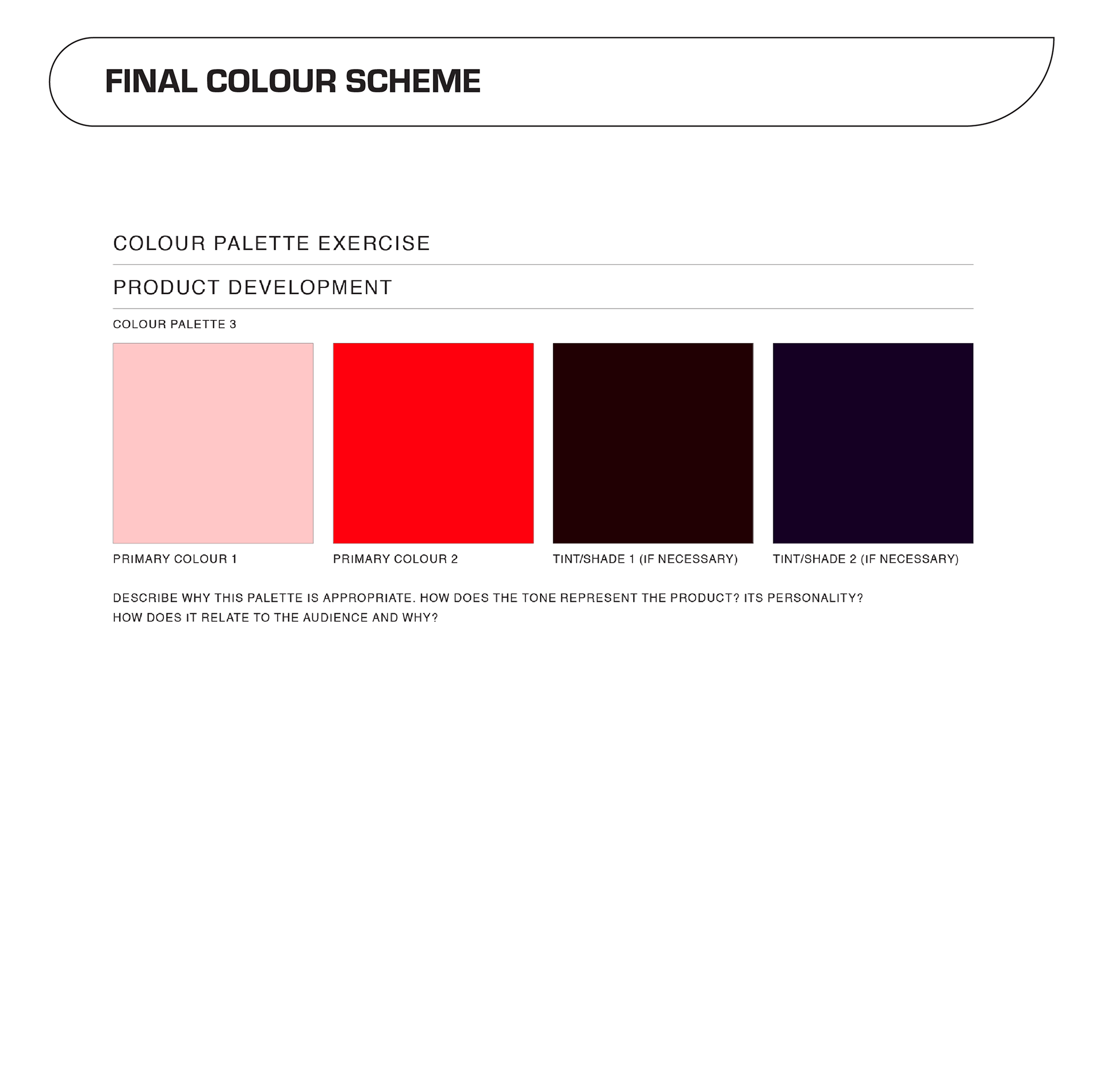
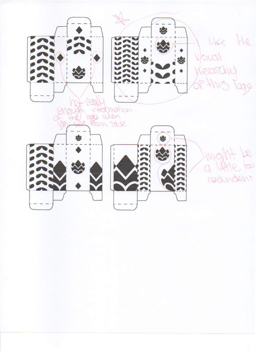
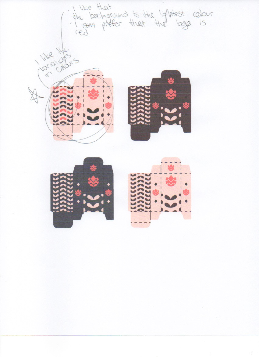
I experimented with different colour schemes such as analogous, monochromatic, triad, complimentary and compound colour schemes but ultimately ended up choosing a scheme taken from a landscape photograph. It seemed to suite my project and connect to my concept better than the other palettes I was experimenting with. While my logo and colour palette were still semi up in the air and undecided due to uncertainty and perfectionism I began to think about my pattern and my box.
From there I was able to plan out my final execution and bring my project into physical form through cut paper and printed media.